Edvinas Bartkus
Ode to rdio

Great software does not come along often. No one has nailed music listening experience as rdio did. It was the best music app. It is gone for 5 years already. I miss it a lot and I am not the only one who misses it.
What was so great about the product?
Collector experience
First, with rdio I learned to listen to albums. I forgot about the existence of the shuffle button, I forgot about the playlists. It was surprising for me how much thought and work are put into the album itself, and not just to the songs. The sequence of the songs is the journey that the artist is willing to take you and it's a very important part of the music listening.
With this new learning, I started to fall in love with particular albums. I felt like I need to listen to the whole album to understand it. Once I like it, I would add to my Collection. It created the feeling that every album in the collection is special and well-chosen.
In recent years, I have started to practice the music collection by buying vinyl. It became an interesting part of every trip for me and my wife to browse through vinyl shops searching for the music that should be part of our ultimate collection. Nevertheless, my vinyl collection is much smaller than I want it to be. I still like digital music listening experience and I wish I could still keep my bigger collection with digital albums well organized.
Rdio product nailed it by creating a possibility to love the album separately from keeping it in the collection. Loved albums is the subset of your collection that you want to come back to more often than to all the other albums.
In rdio experience, the album was always the primary unit of music. It made a lot of sense and it felt respectful to music. Current solutions are too obsessed with curated and personalized playlists, it often feels like consuming the radio.
Design
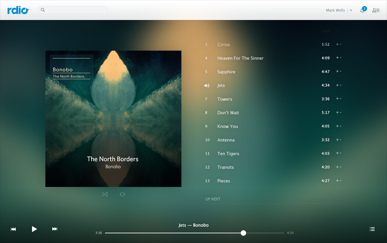
rdio design was before it's time. When iOS design migrated from iOS 6 (skeuomorphic) to iOS 7, it felt like the whole iOS copied rdio design guidelines. Back then I think the rdio product design inspired a lot of other designers to seek minimalism.
As I was going through old screenshots of rdio I found how well it was designed for the small screen. Limited space constraints pushed designers for a better experience. You needed to prioritise action buttons and information you want to display. With rdio, everything was easily accessible and well-chosen where is your focus.
In the product UI, it felt like the album cover art is the central piece of every screen. This also resembled that feeling of putting posters of your favorite bands or movies on your wall in your teenage years. The minimal design embraces the art of the content and album covers are as important as the lyrics and the melody.
Playback
The unique feature that I haven't seen yet replicated by any other music player is the ability to manage your listening queue by albums. Yet again, if you add an album to the queue you get the album as an entity in the queue. It was very convenient to resort the queued albums instead of dealing with a bunch of songs on the long list.
rdio felt completely opposite to the radio but it mastered music discovery pretty well. You could start listening to a station based on an artist and at any time you could choose the degree of how adventures you want to be with the next recommended song. It was brilliant!
Social
An important part of music discovery was having social features. You could follow other members and see what they are listening to, adding to their collection. The social side of the product did not felt obtrusive. It was integrated elegantly.
The whole social network of rdio reminds me of Letterboxd. It was about reviewing and taking care of the well being of your collection first, discovering, and socializing second. After all, probably great product attracted great a community and it was lively.
Conclusion
Compared with the current state of music listening services, it does not seem that rdio was so unique or radical. Using Spotify and Apple Music you can still enjoy music. There is just less excitement in spending hours and hours with music.
Small details make a big difference. I choose to believe that rdio product designers were well opinionated what music listening experience should be and they did not have to deal with design committees that end up with compromises.
Some of the small neat details cost a lot of time to develop (queued albums for example) and this was not good in a competitive market. In my view, rdio is a great example where the best product does not necessarily win.
All my praises are completely subjective. At least I am not the only one who admired it:
As part of getting into SwiftUI, I will be dedicating my free time for the next side project to bring back some of the best rdio experience in a music player. Since my thoughts are coming back to rdio again and again, it should be an exciting project to play with, in my free time.